Purchase statistics in Skolon’s data visualization


Purchase statistics in Skolon’s data visualization
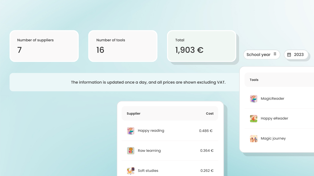
Now you can quickly get an overview of the purchases you have made during a selected period. Perfect for reporting how purchases change over the years, which educational materials you buy the most of, how costs are distributed and what usage looks like for a selected period.
On the overview page, you can see the three suppliers you have shopped from the most during the selected period. You can also see the top three purchased tools.
The cost per tool tab shows a list of the tools you have shopped for during the selected period. The cost per supplier tab shows a list of the suppliers you have shopped from during the selected period.
The different lists contain information about cost and usage. All columns are sortable so you can easily and quickly get the information you are most interested in.
Information
Share this story
Subscribe
Would you like our newest articles delivered to your inbox? Sign up now!
Purchase statistics in Skolon’s data visualization
Now you can quickly get an overview of the purchases you have made during a selected period. Perfect for reporting how purchases change over the years, which educational materials you buy the most of, how costs are distributed and what usage looks like for a selected period.
On the overview page, you can see the three suppliers you have shopped from the most during the selected period. You can also see the top three purchased tools.
The cost per tool tab shows a list of the tools you have shopped for during the selected period. The cost per supplier tab shows a list of the suppliers you have shopped from during the selected period.
The different lists contain information about cost and usage. All columns are sortable so you can easily and quickly get the information you are most interested in.
Share this story
Subscribe
Would you like our newest articles delivered to your inbox? Sign up now!


